


Colour plays a far bigger role in interior design than many people realise. Beyond simply making a room look attractive, colour has the power to influence mood, shape perception, and define how a space is experienced. The right colour palette can make a small room feel expansive, create a sense of calm after a long day, or energise a space where creativity and conversation thrive. Despite this, many homeowners feel overwhelmed when faced with the question: How do you choose the right colour palette for your home?
The good news is that choosing colours doesn’t have to be intimidating or complicated. By following a clear, step-by-step approach, you can make confident decisions that reflect both your personal style and the practical needs of your space. This comprehensive eight-step guide will help you navigate the process and create a colour palette that feels cohesive, intentional, and uniquely yours.
Table of Contents
Step 1: Understand Your Space and Lighting
Before selecting any colours, take time to truly understand your space. Lighting has a dramatic impact on how colours appear. Rooms flooded with natural light tend to showcase colours more accurately, while darker spaces or rooms with limited windows may cause colours to appear muted or shadowy.
Artificial lighting also plays a role. Warm lighting can make whites appear yellow and intensify warm hues, while cool lighting may give colours a bluish or grey undertone. Observe your room at different times of day and under different lighting conditions. This awareness is a crucial first step in learning how to choose the right colour palette for your home.

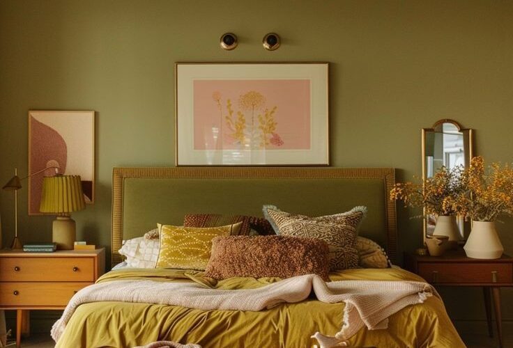
Step 2: Apply the 60-30-10 Rule
One of the most trusted principles in interior design is the 60-30-10 rule. This formula creates visual balance and prevents a space from feeling chaotic or overwhelming.
- 60% of the room should be a dominant colour, usually applied to walls or large surfaces
- 30% should be a secondary colour, often found in furniture, curtains, or rugs
- 10% should be an accent colour used for décor, artwork, or accessories
This rule provides structure while still allowing creativity, making it easier to combine colours harmoniously.

Step 3: Define the Mood You Want to Create
Every room serves a purpose, and your colour choices should support that function. Ask yourself how you want the space to feel when you walk into it.
- Relaxed and calm: Soft blues, greens, and muted neutrals
- Warm and energetic: Reds, oranges, yellows, and rich earth tones
- Sophisticated and elegant: Neutral palettes with touches of black, gold, or metallic accents
Let emotion guide your decisions. Understanding the mood you want is central to mastering how to choose the right colour palette for your home.
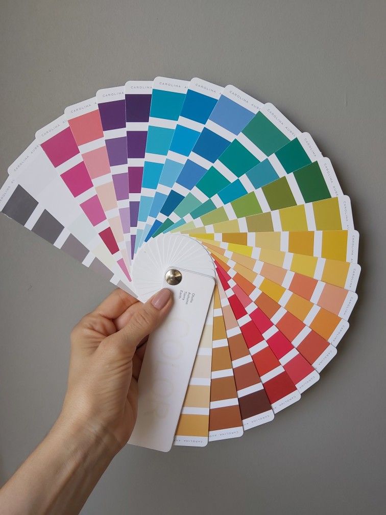
Step 4: Explore Colour Tools and Samples
Modern technology makes colour exploration easier than ever. Online tools from brands like Sherwin-Williams or Benjamin Moore allow you to visualise palettes and experiment with combinations. However, digital previews are only a starting point.
Always order physical paint samples and test them directly on your walls. Paint small sections and observe how they change throughout the day. This hands-on step prevents costly mistakes and builds confidence in your final choice.
Step 5: Coordinate With Existing Furniture and Décor
Unless you’re designing an entirely new space, your colour palette should work with what you already own. Flooring, sofas, cabinetry, countertops, and even artwork all influence colour decisions.
Instead of fighting these elements, use them as inspiration. Pull subtle tones from existing pieces and incorporate them into your palette. This creates a sense of cohesion and makes the room feel thoughtfully designed rather than forced.
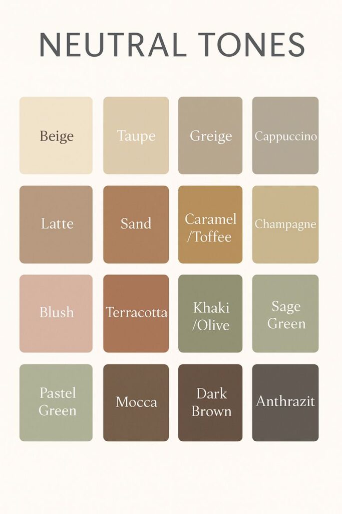
Step 6: Embrace the Power of Neutrals
Neutrals are the backbone of many successful interiors. Shades of white, beige, grey, and taupe offer flexibility and longevity. They allow bold accents to shine while keeping the overall look balanced.
A neutral foundation also makes future updates easier. You can swap pillows, rugs, or artwork without repainting the entire room. When learning how to choose the right colour palette for your home, neutrals are your greatest ally.
Step 7: Test Colour Combinations Before Committing
Small paint chips can be misleading. Colours often look very different once applied to large areas. Before finalising your choices, test full combinations together.
Paint larger sample sections, lay fabric swatches side by side, or use removable wallpaper to visualise how colours interact. This extra step may take time, but it can save you money, stress, and regret later.
Step 8: Consider Finish and Texture
Colour isn’t just about hue, it’s also about finish and texture. Matte and flat finishes create a soft, understated look, while satin and eggshell finishes add subtle sheen and durability. Glossy finishes reflect light and can make spaces feel brighter and larger, but may highlight imperfections.
Choosing the right finish enhances your colour palette and ensures it functions well in everyday life.
Final Thoughts
Choosing colours for your home is both an art and a science. When approached thoughtfully, it becomes an exciting opportunity to express your personality and improve how your space feels. By following these eight steps, you’ll move from uncertainty to confidence, creating rooms that feel balanced, inviting, and intentional.
Whether you’re refreshing a single room or designing an entire home, understanding how to choose the right colour palette for your home is the foundation of successful interior design, and the key to creating spaces you truly love.
For more tips, to make your space a unique sanctuary, visit our Tips and Tricks and Interior Design blogs!